|
Before I set about creating the poster for the short film I think I ought to break down what makes a successful short film poster, specifically what makes a good short film poster for the psychological genre.
0 Comments
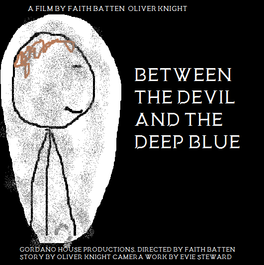 This concept movie poster is focused around the protagonist, The Boy, he is centered on the left side of the poster, typicaly in movie posters this is where the protagonists are placed. As we see in many films the "good guys" move left to right and the "bad guys" move right to left. This poster also has the title font of the film in order to tie it in closer and allow the audience some degree of recognition between the two pieces of media. 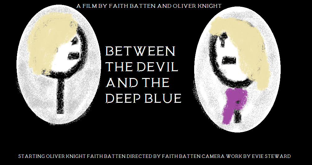 The second draft of the poster changes the focus to the two females in the film. These two are of course, The Mother and The Girl. As above we have followed the convention of movie posters having the protagonists on the left side of the poster and the antagonist on the right. Futhermore this dualality could tempt people into comming to see the film as it establishes the strange and psychological nature of the film.
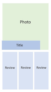 This is the initial layout for the magazine review, we hope that the large image and bold title text will help to rope in an audience. The image will likely be the same image that we will use in our review. The three coloums to the review will reflect the three parts of the review to allow for an easier flow. The first will be general impressions and plot overview, the second will be impressions of the character and opinions on how the story was delivered. The third and final will be rounding out the impressions of the film and making comparisons to other films.
|


 RSS Feed
